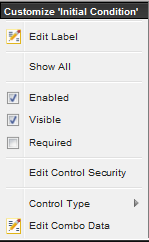
The MET/TEAM user interface
can be customized by right clicking on a screen field label. The Customize
dialog displayed can be used to configure properties about the field that was
selected.
Note: The
Enabled, Visible, Required, and Edit Control Security are not enabled for
MET/TEAM System required fields. If by chance these are available, they do not
have any effect on Read-Only blue
fields.
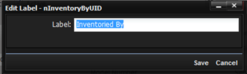
Edit Label – Used to change the data label on the screen. Fill in the Label field on the Edit Label dialog. Press Save and the change is displayed.
Hint: The title of the dialog screen displays the controls associated data name which can be used
when creating data checks.
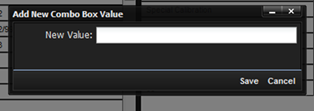
Edit Combo
Data – Displays a dialog used for
configuring the combo data associated with the selected control. New combo
values can be added or removed. Combo boxes can be linked so that multiple
screens share the same set of data.
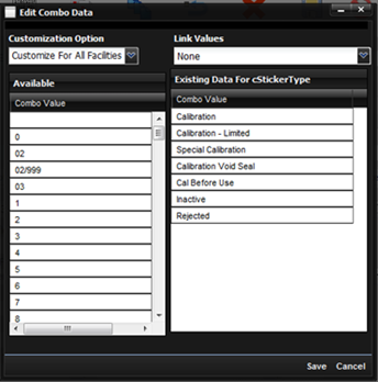
·
Customization
Option – The customization can be for All Facilities or just for This Facility.
o
Select
All Facilities to have the customization take affect for every Facility in the
MET/TEAM application.
o
Select
This Facility to have the customization take affect only for the Facility that
you are currently logged into.
·
Link Values – Select this drop down to associate the selected control with another
drop down box that has already been configured. Both lists will share the same
set of data.
·
Available –List the existing values that have been previously used. Drag a value
from this grid over into the “Existing Data” grid and the value will now be
used in the drop down.
·
Existing Data – List the currently assigned combo box values.
To modify values, simply drag and drop between the two grids.
To
remove a combo box value, right click any item in either grid and select
“Delete Item”.
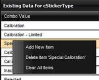
To add a new drop down item, right click either grid and select the Add New Item option. Enter the new value in the dialog.
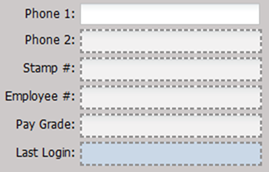
Show All – When selected, any hidden fields are revealed to allow further editing. Any field that is set as hidden is outlined with a dotted gray line.
Enabled – If checked, the control is enabled. If unchecked, the control is disabled and cannot be used. An error message is displayed when trying to make the control disabled if the control has already been marked as “Required”.
Note: Quick Link buttons are enabled or disabled independently
from the control.
Visible – If checked, the control is visible. If unchecked, the control is not visible. An error message is displayed when trying to make the control invisible if the control has already been marked as “Required”.
Required – If checked, the control is required to have a non-empty value every time the screen is saved. If unchecked, the standard behavior will apply. An error message is displayed when trying to make the control required if the control has already been marked as disabled or not visible.
Note: Required is not enabled for checkboxes.
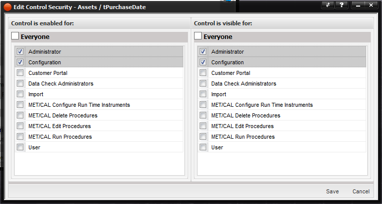
Edit Control Security – Allows for
editing the user groups that the control is enabled for and visible for. Select
the appropriate groups and push the Save button.
Control Type – Allows for changing the
type of the control: Text box or Drop-down list.